Packaging
How to Design Skincare Packaging for Retail Shelf Appeal
Knowing how to design skincare packaging for retail shelf appeal is mostly about winning the first few seconds, when a shopper scans a crowded shelf and decides what deserves a clo
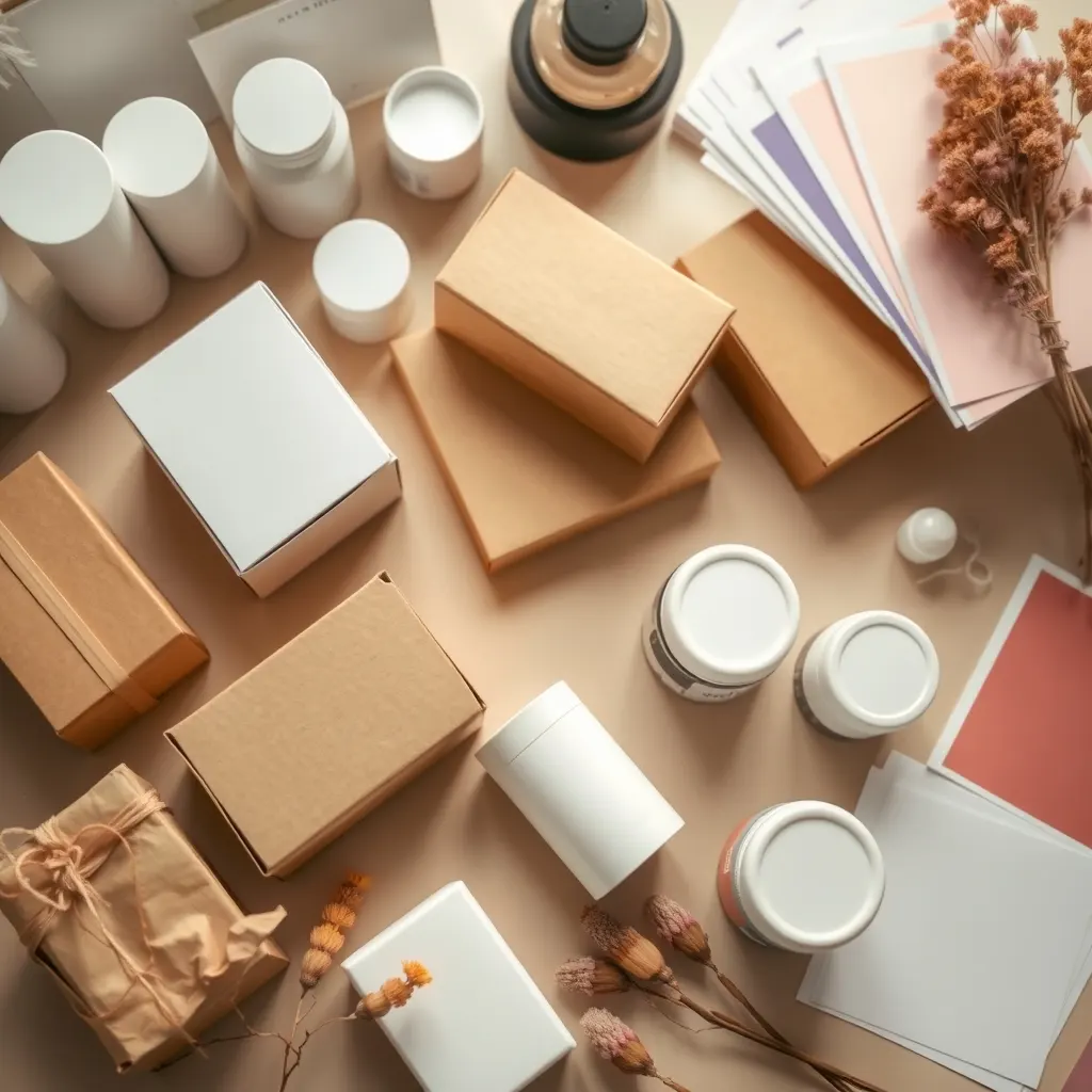
Knowing how to design skincare packaging for retail shelf appeal is mostly about winning the first few seconds, when a shopper scans a crowded shelf and decides what deserves a closer look. Good shelf design is a set of practical choices about hierarchy, colour, shape, information and durability, not just a pretty box. This guide covers how to study the shelf you are entering, what to put on the front, how to design for handling and stacking, and how to test before you print thousands of cartons.
Start with the shelf, not the mood board
Most packaging projects begin with a mood board of beautiful brands. A better start is a photo audit of the real shelf you want to sit on. Visit three or four stores, or study the online category page if you sell on a marketplace, and photograph the products at the angle and distance a shopper sees them.
Then ask three questions of each photo. What stands out from two metres away? What is the first word or shape you read? Which products look interchangeable? You are looking for a gap, such as a colour nobody uses, a format that is missing, or a tone of voice that feels different from the rest.
Write down the shelf context as well: eye level or bottom shelf, vertical or horizontal facing, bright store lighting or dim boutique, and whether the product is sold behind a counter with an adviser. A pack that works in a pharmacy may disappear in a concept store, and the reverse is also true.
Translate the audit into a short design brief with three lines: who the shopper is, what they should notice first, and what they should believe after five seconds. Everything else, from font size to finish, should serve those three lines. If a design choice does not help, remove it before it reaches the factory.
Build a clear hierarchy on the front panel
A shopper will read at most a few things on the front of a pack, so decide the order deliberately. A reliable hierarchy has four levels: brand name, product name and type, the single key benefit or ingredient, and then size or secondary details.
Keep the product type unmistakable. A serum that looks like a perfume, or a cream that looks like a candle, may be charming but creates a second of confusion that a busy shelf does not forgive. Use plain language such as 'night cream' or 'cleansing gel' in a readable size.
Colour carries meaning faster than words. Use it to separate your range into clear families, for instance one colour per concern or per step in a routine. This helps a shopper who is picking the second product after the first one, and it makes your facing look like a block on the shelf rather than scattered items.
Font choice is functional. Thin, light-grey type looks refined on a screen but can be unreadable under store lights or for older shoppers. Test your type at actual print size, in real lighting, held at arm's length.
Leave breathing space. Crowding every benefit onto the front weakens all of them. Put detail on the sides and back, where curious shoppers will look, and keep the front calm and confident. That restraint is part of your brand strategy, and it usually costs nothing.
Choose shape, finish and materials that survive the shelf
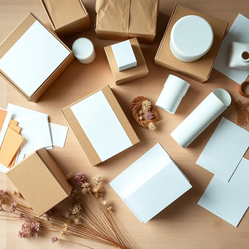
A distinctive shape helps you stand out, but a shelf is also a rough environment. Packs are handled, tested, dropped, rubbed against neighbours and sometimes stacked. Design for that reality from the start.
Check the practical points one by one:
- **Footprint:** a very wide or irregular pack takes more shelf space and may be refused or moved to a poor position.
- **Stability:** a tall, narrow bottle with a heavy cap tips easily when partly empty in testers.
- **Finish:** matte surfaces look elegant but show scuffs and fingerprints; gloss reflects store lights and can hide small print. Ask for printed finish samples, not only digital renders.
- **Closure:** make sure the cap, pump or lid is secure enough that a display unit does not leak or open in transit.
- **Cartons:** a tight, well-fitted carton protects the product and makes the shelf look neat. A loose carton rattles and looks cheaper.
For cosmetic and skincare OEM projects, packaging samples should be filled with the real formula before you approve them. Some formulas stain, soften or react with certain plastics and coatings, so a beautiful pack that fails after a few weeks on a warm shelf is a costly lesson. Ask the factory to run compatibility and stability checks on the final pack, not on a lookalike.
Information, claims and compliance on the pack
A shelf-ready pack still has to carry the information the market requires. Plan the layout around that content from the beginning, because adding mandatory text late is the most common reason designs look cramped.
Typical items include product name and function, net content, ingredient list, usage directions, warnings, batch or lot code, manufacturer or brand-owner details, country of origin and a barcode. The exact list and format vary by market, so confirm the rules with the authority or customs agent in the country where you will sell rather than copying a competitor.
Be careful with claims. Words such as 'dermatologist tested', 'hypoallergenic' or 'clinically proven' can require supporting evidence and may be regulated. If you cannot document it, do not print it. The same applies to categories with extra sensitivity: a baby skincare range needs especially conservative wording, clear usage instructions and a very careful approach to anything that implies safety or medical benefit.
Leave a clean, flat area for batch codes and labels so they do not land on a curved surface or over a design element. Decide early whether inkjet coding, a sticker or an embossed code will be used, and tell the factory.
Finally, check language. If you sell in more than one country, plan space for translations or a sticker system instead of redesigning the whole carton each time.

Test, refine and plan the first print run
Before committing, put the design in front of real people in a realistic setting. You do not need a lab. Print a small number of mock-ups or digital proofs, place them on a photo of an actual shelf, and ask ten people from your target group to find your product, describe what it is for, and say what price tier it looks like.
Watch for three signals. Can they find it quickly? Do they describe it the way you intended? Does the perceived price match your plan? If not, change the hierarchy or colour rather than adding more words.
Then move to physical samples. Check colour on the final material, because the same artwork can look different on paper, plastic, glass or metal. Ask your supplier for a pre-production sample and approve it in writing. Keep a reference sample so later reorders match.
The filling plan should also be settled before printing. Most Thai OEM/ODM factories plan each SKU around the standard minimum of 1,000 units per SKU, and packaging items have their own minimums, so a design with many variants multiplies cost quickly. Consider a shared carton shape across the range with colour changes only.
Finally, document dimensions, finishes, colour references and supplier details in one file. That record saves time, protects your brand look and makes the second production run far smoother.
Need expert support?
Leave your details and our team will get back to you.
FAQ
Frequently asked questions
How many seconds do I really have to catch a shopper?
There is no fixed number, and studies vary, but the practical lesson is that the first impression is quick. A shopper scans a shelf, notices a few products and then looks closer at a handful. Design the front so brand, product type and one key benefit can be read in a glance.
Is matte or gloss better for skincare packaging?
Neither is universally better. Matte looks refined but can show scuffs and fingerprints; gloss is more durable to wipe but reflects store lighting. Choose based on your brand tone and shelf conditions, and always request printed finish samples on the final material before approving a full run.
Should I design for retail and online at the same time?
Ideally yes, because many buyers first see the pack as a small thumbnail. Make sure the brand name and product type remain legible at small size, and use strong colour blocks. A design that works as a tiny image usually also holds up well on a physical shelf.
Prepared by the OEM Thailand team for informational purposes. Some links may lead to referred partners.
Articles
Related articles
How to Choose a Dropper Bottle for Serum Packaging: A Brand Guide
The dropper bottle is the default serum pack for a reason: it signals precision, doses small amounts and looks at home on a premium shelf. But a poorly matched dropper can leak, co
Glass vs Plastic Jars for Cosmetic Packaging: A Brand Owner's Decision Guide
Choosing between glass and plastic jars looks like a packaging detail, but it actually touches formulation stability, shipping costs, retail positioning and even how a buyer percei
What Packaging Works Best for Humid Climates? A Brand Guide
What packaging works best for humid climates? For most cosmetic brands the answer is a closed system with a proven moisture barrier, a label that survives condensation, and shippin

Tubes vs Bottles for Skincare Packaging: A Brand Owner's Decision Guide
Packaging decisions shape how a product feels in a customer's hand, how long it lasts on the shelf, and how much it costs to ship. The tubes vs bottles for skincare packaging quest

Cosmetic Packaging Options Explained: A Brand Owner's Guide to Choosing Right
Packaging is often the last decision brand owners make and the first thing customers judge. Before you start your own brand in the beauty or wellness space, it helps to understand
Sustainable Cosmetic Packaging: What Brand Owners Need to Know Before They Choose a Supplier
Sustainable cosmetic packaging has moved from a marketing nice-to-have to a question buyers and regulators actually ask. But "sustainable" covers a wide range of materials, claims