Packaging
Custom Box Design for a Skincare Brand: A Decision Guide
Custom box design for a skincare brand is usually treated as the fun part at the end. It is actually a set of engineering decisions that lock in cost
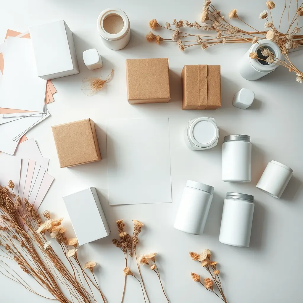
Custom box design for a skincare brand is usually treated as the fun part at the end of development. It is actually a set of engineering decisions that lock in your unit cost, your reprint risk and how your product survives a shipping container. Brand owners who approve artwork before they have settled board, style and dieline almost always pay for it twice. This guide walks the decisions in the order a packaging engineer would take them.
Five jobs your box has to do before it looks good
A secondary carton is not decoration. Before you judge a design, check that it does all five of these.
**Protect.** The box takes the knocks your bottle cannot. It resists compression when cartons are stacked on a pallet, and it stops a dropper or pump from being crushed in transit.
**Hold the product still.** A bottle rattling inside an oversized box arrives with a scuffed label. Fit is a design parameter, not an afterthought, and it is the single most common fault in first-time packaging.
**Carry the legally required information.** Ingredient list, net content, manufacturer and responsible-party details, batch and date coding, warnings and any market-specific symbols all need planned space. Retrofitting them later is what forces reprints.
**Sell on a shelf and on a screen.** Your box has to read at arm's length in a store and as a thumbnail on an e-commerce listing. Those are different design problems, and a layout that only works at full size will disappoint you online.
**Fit the logistics.** Box dimensions determine how many units fit a shipping carton, how many cartons fit a pallet, and therefore your freight cost per unit. A few extra millimetres of width can cost you a whole row on a pallet.
Agree these five requirements with your partner — and with whoever is handling formula development, since pack choice and formula interact — before any designer opens a file.
Box styles and when each one earns its cost
Most skincare cartons fall into a handful of standard constructions, and the choice is driven by weight, perceived value and filling method.
**Straight tuck end folding carton.** The default for most skincare. Flat-shipped, machine- or hand-assembled, economical, and strong enough for a bottle, tube or jar. Tuck flaps on the same side make it slightly less secure but cheaper to make.
**Reverse tuck end.** Similar cost, flaps on opposite sides, easier to hand-assemble. Common for small-batch and launch runs.
**Crash lock bottom.** The base pre-glues and snaps open, which speeds assembly considerably and holds heavier contents. Worth it when you are packing by hand in volume or when the product is heavy, such as a glass pump bottle.
**Rigid or set-up box.** Two-piece, non-collapsible, substantially heavier and more expensive. Justifiable for premium gifting, serum sets and limited editions, rarely for a core daily product.
**Sleeve over a tray or tube.** Material-light and visually clean, but offers little protection on its own.
**Mailer-ready carton.** Designed to survive shipping without an outer box, relevant if your main channel is direct-to-consumer.
If your plan spans several categories — say a skincare line plus a hair care OEM range — standardising on one or two constructions across SKUs reduces tooling, simplifies assembly and lets artwork templates carry over.

Board, thickness and the structural choices underneath
The substrate is where unit cost and perceived quality are actually decided, and it is invisible in a digital mockup.
**Board type.** Folding cartons for cosmetics typically use a coated board with a white printable face. A fully bleached board gives the cleanest whites and the best photographic reproduction; boards with a recycled grey core cost less and are often preferred for sustainability positioning, but white ink coverage and colour accuracy behave differently on them. Ask for printed samples on the actual board, never a mockup.
**Thickness or grammage.** Heavier board feels more substantial and resists crushing, but costs more per sheet, takes more volume in freight and may need adjusted creasing. The right answer depends on product weight and distribution route, not on preference.
**Grain direction and creasing.** Board has a grain. Creases running the wrong way crack along the fold, especially through dark ink coverage. This is a production detail your supplier controls, but it is worth asking about, because cracked folds on a dark box are one of the most visible defects a customer sees.
**Inserts and fitments.** A paperboard insert, moulded pulp tray or corrugated divider keeps the bottle centred. Pulp and moulded options read as sustainable; both add cost and sometimes tooling.
**Coatings.** A varnish or laminate protects ink from scuffing in transit. Matte laminate marks more easily than gloss; soft-touch finishes look premium and show fingerprints. Decide with a physical sample in hand, after it has been rubbed.
Print and finishing: what actually drives the price
Print cost is not one number. It is the sum of several independent decisions, and knowing which ones move the needle lets you spend where it shows.
**Process.** Offset lithography is the workhorse for folding cartons: excellent quality, with plate costs that amortise across the run. Digital printing avoids plates, which makes short runs and multi-variant launches more viable, with a higher cost per unit. Flexo appears on some substrates. For a first run at the standard minimum order quantity of 1,000 units per SKU, ask your partner to price both processes — the answer is not always the obvious one.
**Number of colours.** Each additional ink is a plate and a press unit. A design built on two well-chosen colours can look more expensive than a four-colour design, and it reprints more consistently.
**Special inks and finishes.** Metallic ink, hot foil stamping, embossing and spot UV each add a tooling charge, a pass or both. Dies for foil and embossing are one-off costs that hurt on a small run and disappear on repeats.
**Coverage.** Heavy solid ink over large areas raises cost and increases the risk of visible scuffing and crease cracking.
**SKU count.** This is the lever brand owners underestimate. Six variants mean six sets of plates. A shared base carton with a variant-specific label or a single changed panel can cut setup cost dramatically — a tactic worth considering for any line, from sunscreen to men's grooming products.
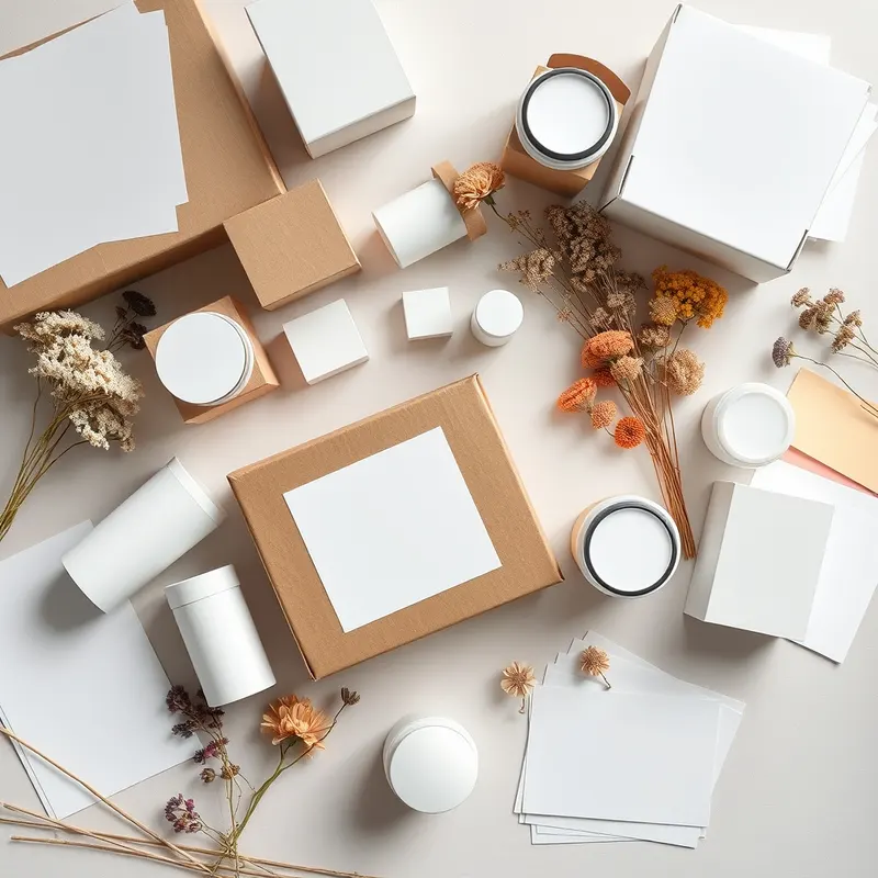
Dieline, artwork and a proofing sequence that prevents reprints
Do the steps in this order. Reversing any two of them is how brands end up with a pallet of unusable cartons.
1. **Confirm the primary pack first.** Final bottle, tube or jar, with cap and pump fitted. Dimensions from a catalogue are not enough; components vary. 2. **Request the dieline from the packaging supplier**, built around that physical component, with bleed, safety margins, crease lines and glue areas marked. Never design to a dieline you drew yourself. 3. **Place content, not decoration, first.** Map the mandatory information panel, barcode zone and batch-coding area. What is left is your design space. 4. **Design to the dieline**, keeping critical text away from creases and the glue flap. 5. **Check the barcode** at final size with adequate quiet zones, and verify that it scans from a printed sample. 6. **Get a white sample or unprinted mock-up**, assemble it, insert the real product, and handle it. Many fit problems reveal themselves here in seconds. 7. **Get a colour proof** on the specified board and finish. Screen colour is not print colour, and brand colours can shift noticeably between substrates. 8. **Approve in writing** with a dated sign-off referencing the proof version.
If you are also producing adjacent products such as a health supplement OEM line, run this sequence per pack format rather than assuming one approved file transfers. Different contents and different regulatory panels mean different layouts, even when the box looks identical.
Regulatory panel, sustainability claims and the usual mistakes
The design decisions that cause the most expensive problems are rarely aesthetic.
**Information panel.** Labelling requirements differ by destination market and are revised periodically: ingredient naming conventions, net content format, language requirements, responsible-party details and symbol usage all vary. Plan a generous panel, and confirm the current rules for every launch market with the relevant authority or a regulatory consultant before you print. Designing for one market and hoping the box travels is a classic and costly error.
**Claims.** Wording on the box can change how a product is categorised. A moisturiser that claims to treat a condition may no longer be handled as a cosmetic. Keep claims within what your category and your documentation support.
**Sustainability wording.** Recyclability depends on local collection systems, and laminates, foils and metallic inks can affect it. Say only what you can substantiate, and ask your supplier what the finish does to recyclability before the marketing copy is written.
**The mistakes that recur most:**
- Approving artwork before the final component is in hand.
- No space planned for batch and expiry coding, which is applied in production.
- Dark heavy coverage across a crease, leading to cracking.
- Ignoring how the box reads as a small thumbnail online.
- Choosing a finish from a screen rather than a physical sample.
- Multiplying SKUs without counting the plate and die cost each one adds.
A last piece of advice: bring your packaging conversation and your manufacturing conversation together early. Working through both with one OEM manufacturer in Thailand, rather than sequentially with separate parties, is usually what keeps the dieline, the formula and the filling line compatible.
Need expert support?
Leave your details and our team will get back to you.
FAQ
Frequently asked questions
How many units do I need for a custom printed box?
Plan your first run around the standard 1,000 units per SKU and build the budget from there. Remember that plates, dies and proofs are one-off charges spread across that quantity, so several small variants cost considerably more in total than one larger SKU of equivalent volume. Ask your partner what the same box costs at double the quantity to see how much of the price is setup.
Should I use digital or offset printing for a first run?
It depends on quantity, colour count and how many variants you are launching. Digital avoids plate charges, which suits short runs and multi-variant launches, while offset usually wins on unit cost once volumes rise and gives more options for special finishes. Ask for both quoted on the same specification rather than deciding in advance.
Do I need a box at all if my bottle already has a label?
Not always. A sleeve, a shrink band or a well-designed label can be enough for some products and channels, and skipping the carton reduces cost and material use. A box earns its place when you need extra protection in transit, more space for mandatory information, a stronger shelf presence, or a gifting feel. Decide by channel and product fragility.
Who should create the dieline, me or the factory?
Ask the packaging supplier who will actually print it, because the dieline has to match their tooling, board and machinery, and it must be built around your exact primary component. Your designer then works inside that file. Designing to a generic template found online is one of the most frequent causes of fit and crease problems.
How do I avoid a reprint?
Lock the component, then the dieline, then the mandatory information panel, and only then the design. Check the barcode from a printed sample, assemble a physical white mock-up with the real product inside, and approve colour from a proof printed on the specified board and finish. Sign off in writing against a dated proof version so everyone is approving the same file.
Prepared by the OEM Thailand team for informational purposes. Some links may lead to referred partners.
Articles
Related articles

Cosmetic Packaging Options Explained: A Brand Owner's Guide to Choosing Right
Packaging is often the last decision brand owners make and the first thing customers judge. Before you start your own brand in the beauty or wellness space, it helps to understand
Airless Pump vs Jar for Skincare: How Packaging Choice Shapes Your Formula, Cost and Shelf Life
If you're developing a cream, serum or balm with a Thai OEM/ODM factories partner, packaging decisions usually come up earlier than most new brand owners expect — often before the

Glass vs Plastic Jars for Cosmetic Packaging: A Brand Owner's Decision Guide
Choosing between glass and plastic jars looks like a packaging detail, but it actually touches formulation stability, shipping costs, retail positioning and even how a buyer percei
How to Design Skincare Packaging for Retail Shelf Appeal
Knowing how to design skincare packaging for retail shelf appeal is mostly about winning the first few seconds, when a shopper scans a crowded shelf and decides what deserves a clo

How to Choose a Dropper Bottle for Serum Packaging: A Brand Guide
The dropper bottle is the default serum pack for a reason: it signals precision, doses small amounts and looks at home on a premium shelf. But a poorly matched dropper can leak, co
What Packaging Works Best for Humid Climates? A Brand Guide
What packaging works best for humid climates? For most cosmetic brands the answer is a closed system with a proven moisture barrier, a label that survives condensation, and shippin